
I once gave a presentation at my church on “Why Bible Typography Matters.” It was announced a month or so in advance, and people started making comments to me about it. Someone said, “You’re going to talk about Bible typology—like how Joseph prefigures Christ? I love that!” Someone else said, “How can you talk for a whole hour about Bible topography? What is there to say about levels of elevation in Bible lands?”
What is Bible typography?
I tried to explain that typography is the art and science of arranging text on a printed page. This did not persuade anyone I was aware of to get excited, but they all dutifully showed up anyway.
They ended up paying great attention, and they asked truly great questions at the end. The sound guy later told me, “When I saw your topic I expected to be bored out of my mind, but I was actually on the edge of my seat!”
I was able to persuade at least a few people, then, that Bible Typography Matters. Though I was not there to shill books, the church bookstore sold over 50 ESV Reader’s Bibles as a result. I showed that typography matters because it carries meaning—paragraph breaks and other conventions indicate thought flow, for example. Typography also matters because it’s easier to take a walk on a smooth sidewalk than an old, broken-up one. Good typography fades into the background and puts the text front and center. This is true in the Bible, and it’s true of all reading, even eBook reading in something like Logos.
Have you ever looked over the different typefaces you have available in Logos? The desktop app comes with several faces each for Greek, Hebrew, and Latin. Here’s how you can pick the one you like—and a suggestion for which one(s) you should like. (All of the frank opinions about fonts you’re about to read are my own and may or may not reflect the viewpoint of Faithlife employees, the Logos user community, or my typography professor in college.)
Latin characters
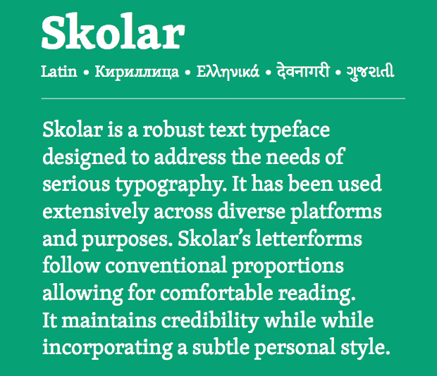
People’s varying tastes and needs are why we offer options in the first place: you can use whatever fonts you own to read English texts. But don’t. Stick with the default: Skolar, designed by master typographer David Březina. Skolar is a perfect typeface for biblical studies: the Rosetta type foundry where Březina is chief type officer calls it “a robust text typeface designed to address the needs of serious typography.” It’s even been customized just for you, for Logos users. That’s why it’s named “Skolar Logos” in the long list of fonts available on your system.
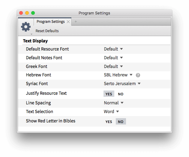
To see this list, just go to your program settings and check out the various “Text Display” options. The very first is your Default Resource Font. Choose a few others you like just to see how they feel, but then trust me and go back to Skolar.
Skolar is so ideal because it has a classic, readable feel on the page with a bit of extra thickness and a pleasing, slightly quirky italic—one that includes some angularity I find peculiarly appropriate for twenty-first century eBook software.
(It’s in the iPad app, too—and it works great in print: a lot of Lexham Press books are set in Skolar. You know that if a Lexham book is set in Skolar, whatever it says is going to be intelligent.)
Greek characters
Like most people, I recently did a little reading about Greek type after noticing that the Complutensian Polyglot of 1514 used a startlingly readable Greek typeface—one that reminded me directly of certain modern printed editions I’ve seen. Greek type, like Latin, is a fascinating and beautiful tradition.
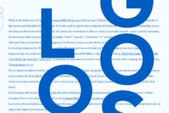
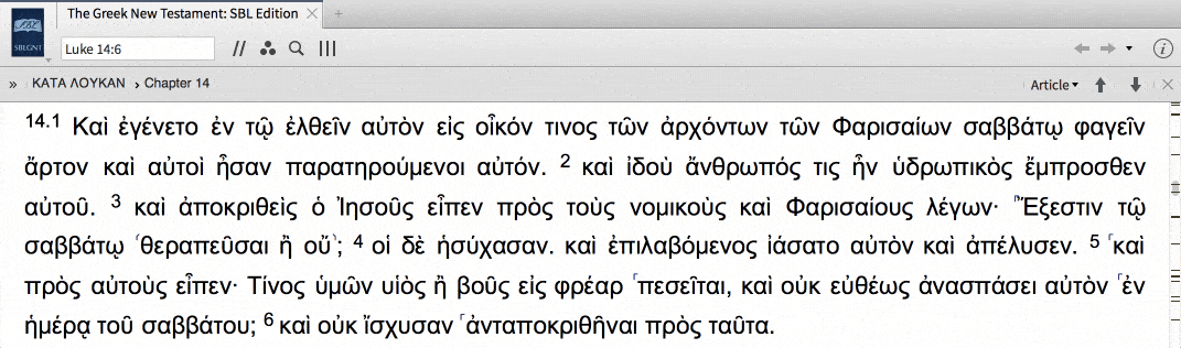
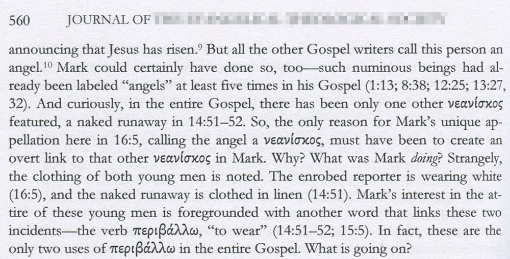
We include several Greek fonts in Logos, but once again I recommend our default: Skolar Polytonic Greek (“polytonic” only means it includes Greek accents). It’s got the same solid, classic feel as the Latin characters, with little pieces of personality stuck in, too, like that interesting theta. The real key for most users, however, is that it pairs so well with Skolar’s Latin characters. You aren’t wrenched from one typographic feel to another as you read BDAG or a commentary in which Greek words are sprinkled throughout otherwise English text. It’s a smooth trip down the typographical sidewalk. I was just reading a major evangelical theological journal and, though the article was excellent, I couldn’t help noting how jarring the Greek typeface is. Do you see it?
I think the Greek jumps out too much; it “weighs” more than the stroke weights of the surrounding Roman text.
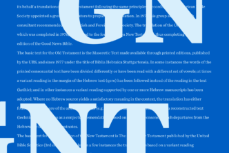
Here’s Skolar Latin and Greek together in Logos. They’re much smoother. Glancing over the paragraph, nothing leaps out distractingly because of its different weight—except the bolded Greek, which is supposed to leap out:
Hebrew characters
There is no default font for Hebrew, and Skolar does not include Hebrew characters. There are two major options.
1) Ezra SIL is fine, though the contrast in stroke weights feels a little too intense for me:
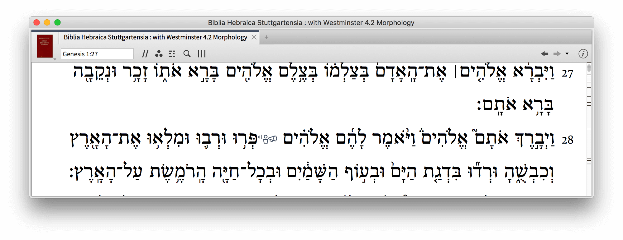
2) I prefer SBL Hebrew. It reminds me, in fact, of Skolar:
Conclusion
The whole idea of Logos is that you’ll be spending countless hours reading text in it; you’re going to want at some point, hopefully early on, to customize its look and feel to your preferences. I like to keep my text justified, keep line spacing (also called “leading”) normal, and—despite the practice’s detractors—show red letters when Jesus is speaking in the New Testament.
But it’s good to educate your preferences a little, too. It’s not an accident that certain typefaces prove more useful than others. Skolar designer David Březina, for example, is an accredited specialist in his field who has dedicated his life to helping you read. I say let him.
***