First, we acquired rights to the Conchillos Ugaritic databank. Then, we acquired the rights to produce several Ugaritic textbooks, grammars, and other helps as well. We put together a product.
Then we had to figure out how to support Ugaritic. [Cue scary music.]
At first, it seemed like it would be pretty easy. Ugaritic was recently added to the Unicode specification, and Logos was Unicode before it was even cool to be Unicode. All we needed was a Unicode Ugaritic font. [Where does that scary music keep coming from?]
Now, there are several Unicode Ugaritic fonts on the web. Trouble is, theyre bound up with various licensing restrictions. Free, but only for non-commercial use. Thats fair: Font designers are craftsmen (craftspersons?) and have the right to dictate terms of use for their own work. Muzzle not the ox that treadeth out the chaff, I always say.
No problem. Im no professional font designer, but Ive been known to whip out a font when necessary. I fired up my copy of FontLab Studio 5 and got to work.
The Shape of Things
I love my job, and heres a good example of why: I would never have learned anything about the Ugaritic alphabet, except that Vince said to me one day, You know youre going to need to make a Ugaritic font, right? Can do. What’s a Yoo-guh-rit-ick?
")
This is a whiteboard discussion that Vince and I had about the general design of a Ugaritic font. Now, I dont know much about Ugaritic, but I do know some about design. Vince knows a little design and a lot more Ugaritic than I do. Two heads really are better than one (Ecc 4:9-12 ), and when you bump up against other people, you both get sharper (Prov 27:17).
So I played around a little bit, and came up with a list of questions that needed answering: What shape should the wedges be? How much do you try to emulate the tablets, and how much do you try to emulate the grammars? What are the standard grammars, and how do they draw certain characters? How tall is each character? Do they have a consistent baseline?
I googled as many tablet images as I could and decided pretty quickly that there wasnt any way to really emulate the look and feel of a stylus pressed into clay. All cuneiform writing has a very three-dimensional quality, and the angle of the light hitting the tablet can change the letter shapes significantly. (And frankly, it looks very much like a parade of chickens walked through wet cement to me.)
 Upon examining the grammars, and talking with Mike Heiser, we decided to emulate the stylized shapes that appear in most grammars: One that looks roughly like a golf tee that represents a standard press-and-drag motion, and one that looks roughly like a boomerang representing a sort of stab. I call them stroke and poke.
 There were a lot of possible shapes to choose from, as there always are. I finally settled on the last two as a reasonable compromise between fidelity, recognizability, beauty, proportion, and readability: A triangular head with just enough curve to seem human. At least, I hope thats the effect. Ive seen both closed and open versions of Ugaritic fonts, and I must say that the open fonts, with the holes in the middle, are much more readable at smaller point sizes.
We decided that a body height somewhere between Latin upper and lower case would be appropriate, which is what the SBL Hebrew font does with Hebrew. Besides, the letters of the Ugaritic alphabet vary quite a bit in height and width. Judging by the tablets, its pretty clear that the scribes had a concept of a line of signs, but not so much a baseline. If anything, they tended to string signs along a horizontal centerline rather than having them sit on a baseline.
This Ugaritic, however, needs to mix well with Latin script, which means a somewhat consistent baseline. So, I took a middle course: I decided that the main body for most letters would fit within a box that was not quite three strokes tall, so that the stem of the bottom stroke would sit on the baseline.
 Tablet showing letters aligned to a midline
 Ugaritic in relation to Roman text.
Letters like alpa  and to
  float along in the middle of the box, like a hyphen. Letters that are one vertical stroke tall like lamda
  and gamla
  sit on the baseline and fill up to the Ugaritic cap height. Other letters, like delta above, sit on the baseline with little projections below. Still others, like i
  hang down even farther.
Variants and Numbers and Ligatures, Oh My!

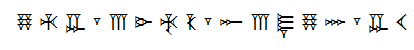
The Unicode consortium, in their infinite wisdom, decided to add only the 30 letters of the Ugaritic alphabet and a word-division mark. Unfortunately, thats less than half (more like a third, give or take) of the known glyphs for Ugaritic. First of all, the Ugaritic tablets have lots of variant glyphs, or different shapes that represent the same character. Secondly, the Ugaritic tablets happen to have a lot of numbers in them. Surprisingly enough, the folks at Ugarit used their own numeric system instead of helpfully adopting our modern Indic/Arabic digits. Silly Ugartians! (Or is it Ugaritians? Ugaritites? Ugarits?)
So, after I did the initial font design, Vince came up with a repertoire of characters we would need and decided where to put them in the Unicode private use zone. Not a beautiful solution, but it works. As you can see from the chart above, we added support for a good number of characters. The Unicode specification covers the orange portion at the top; everything else is a private use zone character.
In short: All in a day’s work. Or two days, as the case may be.
How do I get it?
The Ugaritic font (dubbed Zebul Open) will be available as part of the Ugaritic Library, on pre-pub now.