The style and arrangement of words in your Bible is like wallpaper for most people: you only notice it if it changes, and maybe not even then. But in fact, the typography in our Bibles matters a great deal—and it matters because it means. For instance, when editors place line breaks between two sentences, they are communicating that there’s a shift in the flow of thought. We use paragraphs in modern typography to group related sentences together.
The biblical authors, as far as we know, didn’t use paragraph breaks as we do. And ancient biblical manuscripts have relatively few breaks of any kind. But like periods, quotation marks, and other modern conventions, they have to be there in today’s writing. Their absence communicates something as much as their presence. So editors at Bible publishing houses are forced to choose where to put breaks, and standard editions of the Greek New Testament even notate where paragraphs occur in various major Bible translations.
Modern Bible typography
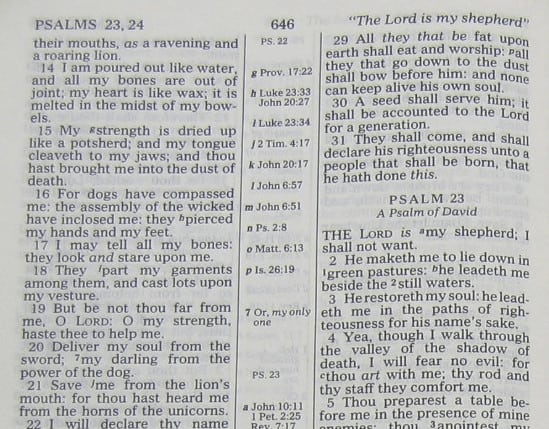
Most English Bibles I have seen in my lifetime were set in two columns per page, and every verse was its own “paragraph”:
What does this standard typographical format mean to readers? What does it communicate? It may mean that each verse is a more or less separate statement. Careful Bible readers know that’s not the intent of the editors, but in normal nonfiction writing, that’s what separate paragraphs convey.
This particular typographical format may subtly pave the way for a bad kind of proof-texting. It can give readers implicit permission to read “A just man falleth seven times and riseth up again” in Proverbs 24:16 without considering the verse before it—the one that clarifies that this man is falling in battle and not (or at least not primarily) falling into sin.
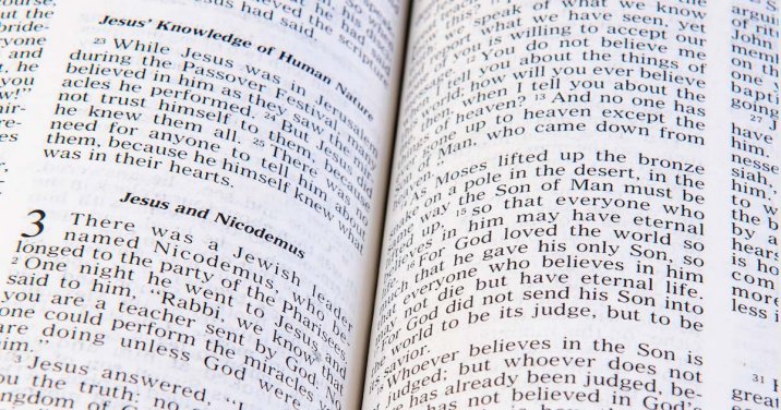
Most Bibles available in Logos reflect the fairly recent shift away from every-verse-a-paragraph typography. The default format of the ESV, for example, is a single column with paragraphs, headings, and verse numbers.
The NASB, by contrast, marks paragraph divisions the way it does in many of its print editions, with a bold verse numeral. Typographically, however, every verse is its own paragraph.
Different approaches to Bible typography are suited for different situations. The NASB’s clearly demarcated verse numbers are great for Bible study or teaching—they make it very easy to know which verse you’re focusing on. But the more common paragraphed approach used by the ESV is better for reading. Paragraphs aid readers by giving them important visual cues, making it easy to see which thoughts go together and where the subject shifts.
Creating a reader’s Bible in Logos
But there’s more that can be done to smooth the way for Bible readers. Unnecessary paragraph divisions aren’t the only intrusion in the Bible text. Don’t forget chapter numbers, superscript letters, footnotes, study notes, cross-references, and all the other things that can clutter up the page—especially if your main goal in a given reading session is in fact reading and not study. In recent years several Bible editions have made innovative attempts at producing a true reader’s Bible.
Print Bibles have to choose one kind of Bible typography or another: the kind that facilitates study or the kind conducive to reading. But Logos Bible Software has something no print edition will ever have: flexibility. Using Visual Filters, you can move back and forth between a study layout and a reading layout in both our desktop and our mobile apps. Let a Logos Pro show you how:
Sometimes, you want to dig deep into your Bible. You need those verse numbers and headings and footnotes and study notes. And Logos has them. In a very real way, Logos Bible Software as we know it would be impossible without verse references.
But sometimes your goal in Bible reading is to cover a lot of ground, to gain a relatively quick overall impression of a biblical book like Luke or even a whole set of them like the Gospels. You don’t want to trip over countless little breaks as you read. You want to take out that unnecessary text in your Bible! I personally toggle back and forth regularly between a reader’s format and a study format.
Try reading through a biblical book—say Colossians, James, or even Proverbs—with your Visual Filters set to produce a reader’s Bible as demonstrated in the video.
And let me know how it goes. I’d love to hear about it in the comments. I’m personally very interested in what Bible readers see when they change out an old (and proven and useful) set of lenses for a fresh pair.
***
If you’ve enjoyed the free training on the blog, visit the Logos training page to get the most comprehensive Logos video tutorials available.